Chart Designer
Overview
The chart designing functionality is part of the Data Source Designer. All charts require some data so integrating this within the tool is much more productive than having a separate tool. The tab of interest is highlighted below.

Charts, like templates, reference a data source to obtain the data driving their output. In this case it is a visualization.
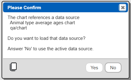
When you load a chart component into the Data Source Designer there is a prompt to also load any chart referenced data source. You can optionally use the Data Source Designer's current component for the data to be charted. If you do this then be aware that saving the chart component will reference that current component. A sample dialog is shown below.
If a data source is saved while a chart component is loaded as well, the saved data source has a reference to the chart component. Loading the data source will also optionally load the chart as well.
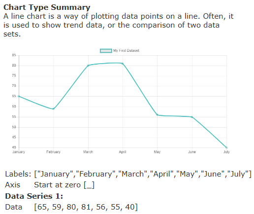
Sample Chart
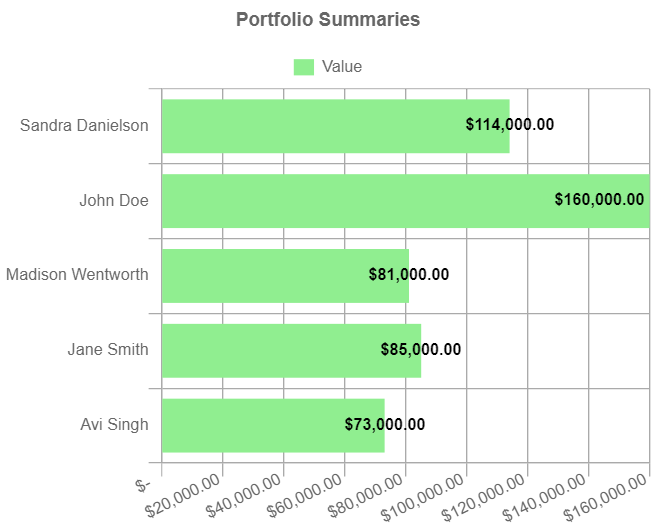
Shown below is an example chart.
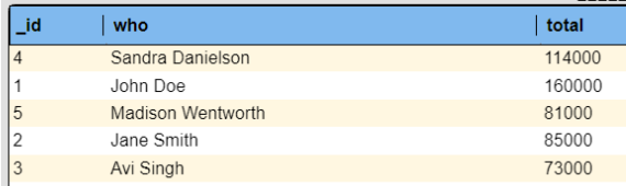
The underlying data for it is shown below.
The list of labels is aggregated using the settings shown below.

Likewise the values to plot use a similar formula as shown below.

Chart Tab Layout
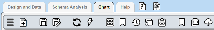
The toolbar within the Chart tab is for managing chart components in a similar way as is done in other Qarbine tools. The related toolbar options are shown below.
The other toolbar options are for working with the chart result. They are described in the section below.

Defining a Chart
Primary Chart Component Properties
Charts, like other Qarbine components, have a name, description and other properties. The top portion of the left hand side panel is shown below.

The bottom portion of that area is used for storage properties.

Main Chart Visualization Properties
Charts generally have a list of labels and a list of associated data points for each label. The Type of chart and the label specification are shown below.

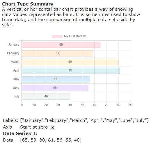
Guidance on the various types of charts is shown to the right. Below is an example when the line type is chosen.
Here is sample help for a horizontal bar type.
Next are optional descriptions of the X axis and Y axis.

The next set of fields are for defining the data to plot.
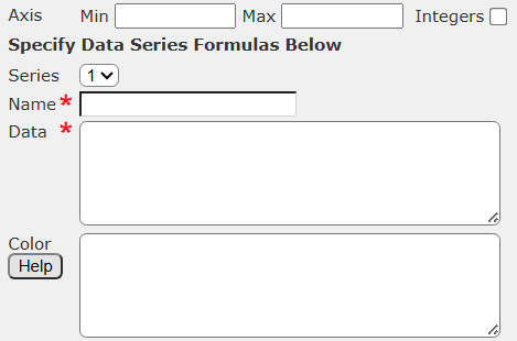
Up to 4 data series can be plotted. However, they share an axis so there should be some magnitude correspondence. Otherwise the visualization can become quite confusing.
Chart Formatting Properties
There are 3 formatting sections. The first is a general one as shown below.
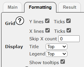
You can click on  to view information about the related options.
The next is for specifying the label formatting options.

The last is for formatting the values in each of the data series.

When there are many data points, reducing the number of displayed labels can avoid a cluttered visual.
Note - The guide at “Tutorials;Template Techniques;Charting Options” has details within the Chart.js section on using these various options.
Generating a Chart
When a chart component is loaded the chart’s visualization is updated when either the data source  or the chart buttons are clicked.
Once a data source has run, you can manipulate the chart and click  to update the visualization. This option does not rerun the data source. It uses whatever answer set is currently available. This avoids unnecessary queries to your database.
Interacting with the Resulting Chart
The tab highlighted below contains the chart result.

If the Chart tab is active then clicking either the or the button automatically activates the Result tab.
The result oriented toolbar options are shown below.
They are described in the following table.
| Icon | Description |
|---|---|
 | Save the result as a chart result component. |
 | Save the result as a new chart result component. |
 | Edit the chart result component’s properties. |
 | Print the chart result. |
 | Export the labels and data used by the chart. The object has separate labels and fields for each data set. Control-click exports using a tabular format. |
 | Create a template containing a chart cell. The chart’s data source is used as the template’s data source. By creating a template, the Qarbine application embedding features can be easily applied. |
The context menu for the result area is shown below.

Generating a Template
A benefit to generating a template containing the chart is that the standard Qarbine application embedding techniques are available. Custom dashboards can be created with a mixture of summary charts and drill down detailed analytics.
A basic chart specification is

…

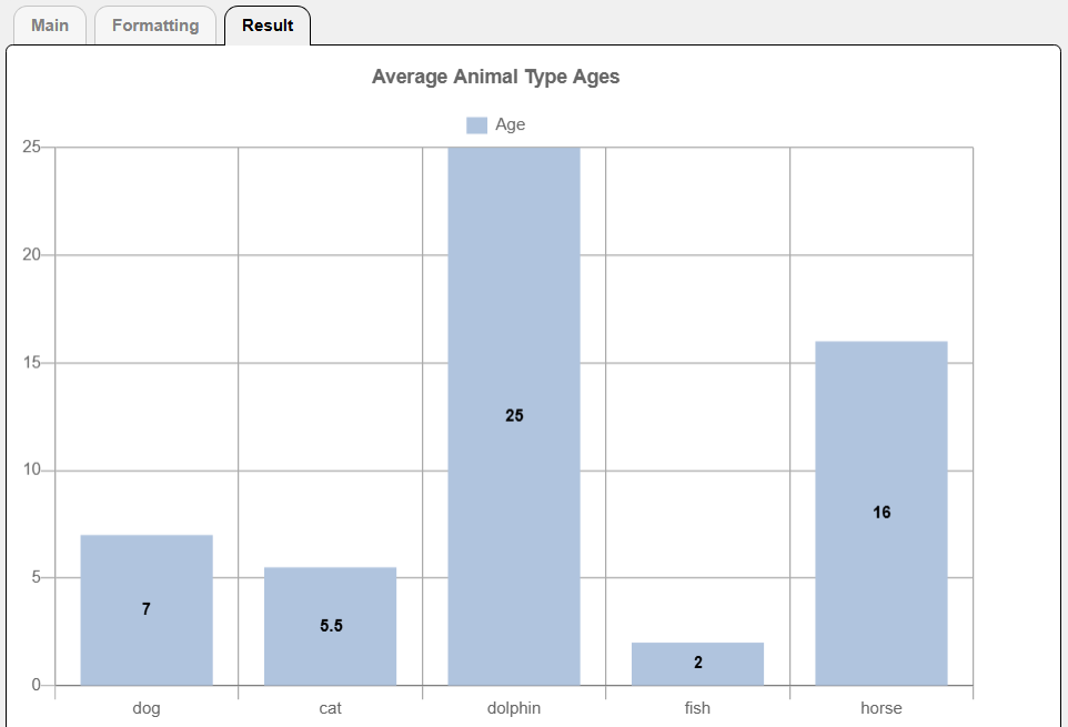
For the answer set below

the corresponding chart result is shown below.
To generate a base template component click .
Navigate to the desired catalog folder.
Next enter the new template’s properties.

The template is generated with a custom graph cell based on the chart’s properties. The general layout is shown below.
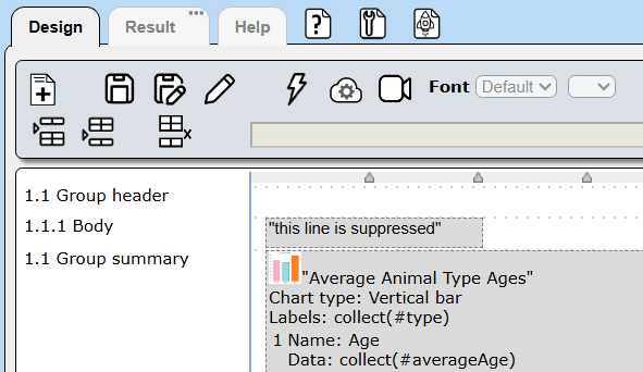
You can adjust the cell’s width and chart properties based on your requirements. You may want to add other template content such as a report header as well.
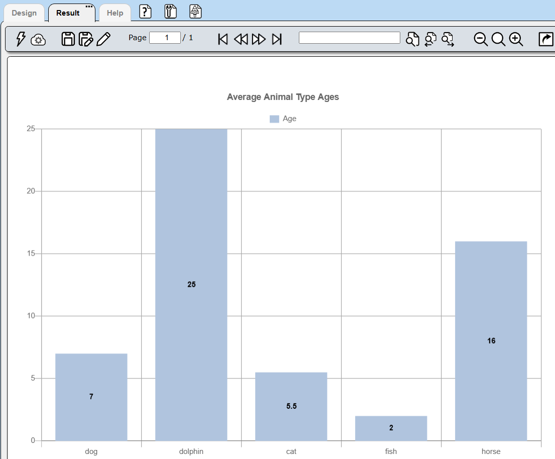
The template’s body line content is not emitted but is needed in order to aggregate the labels and data values to plot on the group summary line. A sample template result is shown below.
As noted above, a benefit to using a template to hold the chart is that the standard Qarbine application embedding techniques are available.